Modern Coastal Design with Kid-Friendly Features

Back in 2020, the pandemic completely shook up the design industry. We had to navigate extreme supply chain delays and even started designing homes in quarantine. In fact, for a while, we were designing homes without ever meeting our clients in person! Today, we’re sharing a completely remote design that we accomplished entirely by phone calls and email. In fact, we didn’t meet our clients in person until we were ready to install!
Luckily for us, this client was incredibly easy to work with. They are a young family of 5, newly living and working from home in the San Diego area. When they initially bought this house, it was a brand new build and completely empty aside from hard finishes, like flooring, cabinetry, and countertops. Our client enlisted us to help make this blank canvas feel like an extension of their family through furniture and decor. They wanted a clean design with some mid-century modern accents and an overall Southern Californian vibe. Most importantly, everything needed to be family-friendly, from the textiles to the furniture.
You may have followed along with bits and pieces of this design (also known as #projectmovintosandiegowhereallthecoolkidsgo) on our Instagram, but today we’re detailing the entire project with you. Read on for all the information on this giant-size transformation!
Open Floor Plan Living
These days, most new houses are designed with grand, open floor plans, where the entryway, living space, and kitchen are connected without any walls dividing walls. Whenever we work with open concept plans, we want to create a cohesive design that ties in all the spaces yet defines each separate room. Here, we designed three unique areas: the entryway, living room, and dining space.
Entryway

We wanted the entryway to be light, bright, and welcoming, so we put a crisp, clean white paint on the walls that livened up the space and emphasized the grandeur of the staircase. As the entryway is typically a guest’s first impression of a home, we also wanted to define the modern coastal design aesthetic of the home. The light oak bench paired with the neutral throw pillows and woven baskets emphasizes the California casual style, and the large planters (linked below) add a contemporary touch.


1. geometric wall art 2. peg hooks 3. hat 4. mesh bag 5. faux fiddle leaf fig tree 6. faux monstera 7. tall planter 8. large planter 9. small planter 10. pillow set 11. leaning mirror 12. bench 13. basket set
Living Room

Because the entryway seamlessly leads into the living space, we wanted to keep the wall color consistent. We then added more whites and cream tones with the sectional and rug for an ultra-clean, monochromatic look. Of course, we made sure to use a performance fabric on the sectional, as family-friendly materials were a top priority for our client. For that reason, we also chose a round coffee table with no hard edges.

To prevent the design from appearing flat, we added heavy contrast with a twist. Rather than a classic black and white look, we opted for dark green accents instead, like the gorgeous sheer curtains. In part, the green adds depth to the room, but it also complements the plants that we carefully placed throughout the home. We’re big on plants at Fleurish and often incorporate them into our designs for the liveliness and color they add!

With only one empty wall in the living room, we chose to add a neutral, beachy gallery wall with floating frames that creates just enough interest without overwhelming the space.

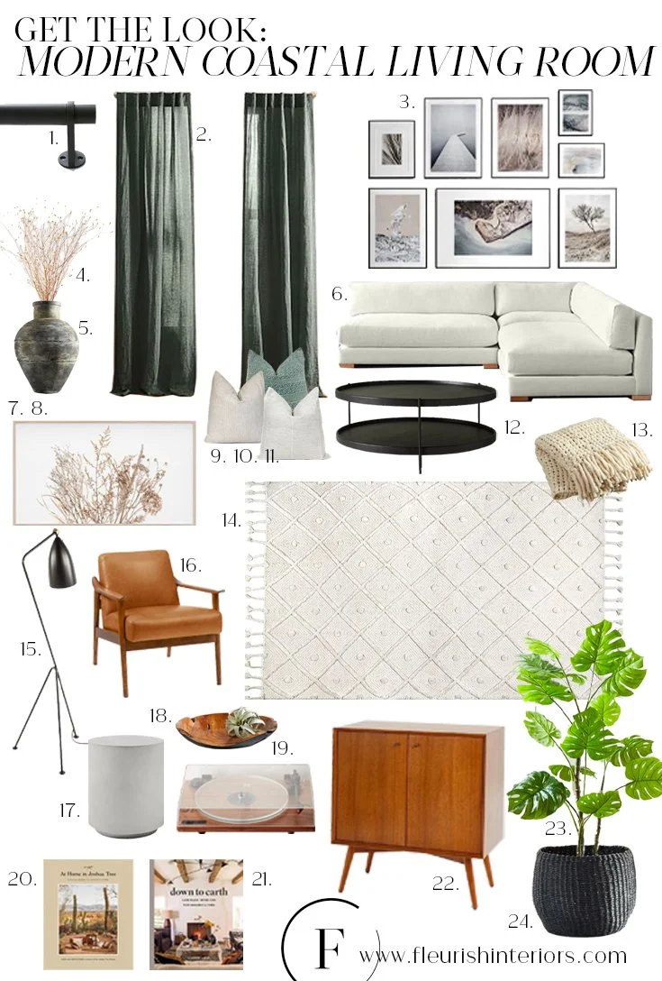
1. curtain rod 2. curtains 3. floating frames 4. dried stems 5. vessel 6. sectional 7. frame tv 8. downloadable art for tv 9. grey pillow 10. blue pillow 11. ticking stripe pillow 12. coffee table 13. throw blanket 14. rug 15. floor lamp 16. arm chair 17. concrete side table 18. wood bowl 19. record player 20. at home in joshua tree book 21. down to earth book 22. media console 23. faux monstera 24. black basket (similar)
Dining Room

Previously, the dining room was just an empty space separating the living room and the kitchen. So to define this open space, we laid a patterned rug and hung a pendant (similar light linked here). The rug helps ground the dining room, and the fun, oversized pendant acts like its own design feature.

Here, we had a fantastic opportunity to add some distinct mid-century pieces, like the oblong Acacia dining table and coordinating curved dining chairs with leather upholstery that’s easy to wipe down after use.

1. art print 2. dish towels 3. faux eucalyptus 4. vase 5. pendant (similar) 6. wood bowl 7. dining in cookbook 8. dining chairs 9. dining table 10. barstools 11. rug
High Contrast Bedroom Designs
Primary Bedroom

We love a dark, moody moment, and this primary bedroom is it. Our client expressed that she liked accent walls. But rather than simply paint a wall and call it a day, we decided to also add texture and movement to the wall for a sophisticated, grown-up look. The traditional paneling behind the bed with the deep, masculine paint provides the perfect focal point.
As contrast plays a leading role throughout the rest of the house, we wanted to play that up in the bedroom by keeping the walls dark and the bedding light. We even added a black rubber plant and black curtains on the two windows, so the whole wall appears black when they’re closed.

In keeping with the dining and living room designs, we also introduced lots of mid-century elements in the primary bedroom, like the bed, side tables, and bedside lamps. Then, we added a few cozy textiles to warm the space, including a leather throw pillow and a knit blanket.

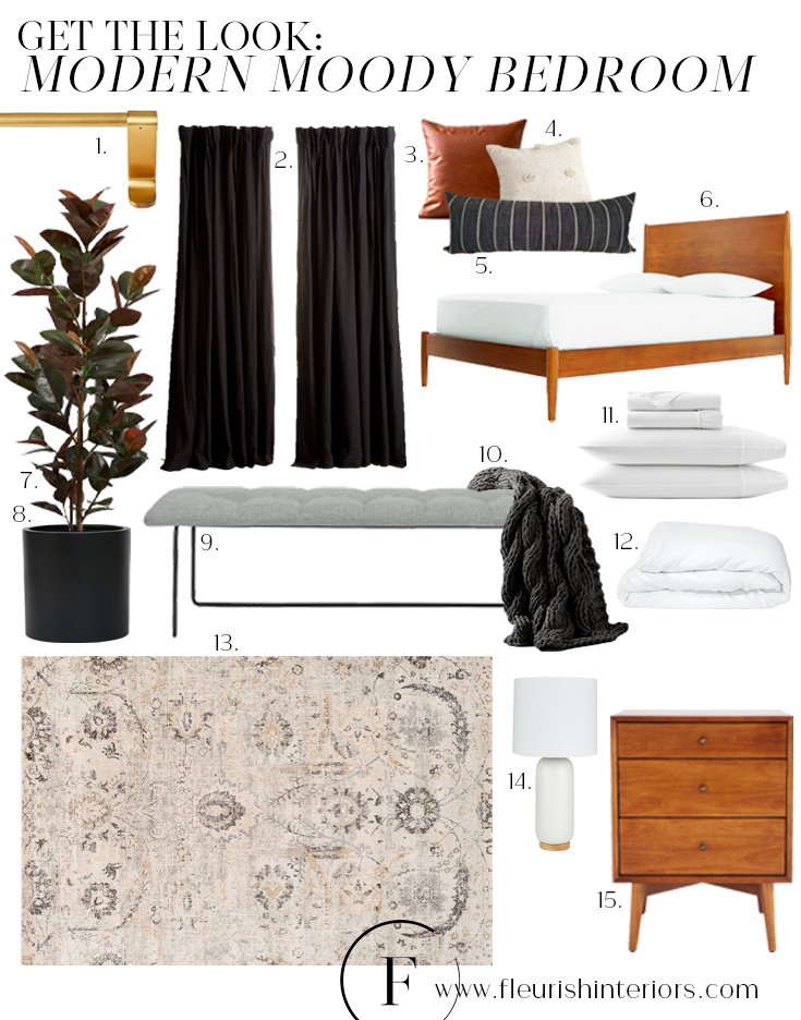
1. curtain rod 2. curtains 3. leather pillow 4. cream pillow 5. black lumbar pillow 6. bed 7. faux rubber plant 8. black planter 9. bench 10. throw blanket 11. sheet set 12. duvet 13. rug 14. lamps (similar) 15. side tables
Guest Bed


The guest bedroom wasn’t a top priority for our client. She simply wanted an affordable design that guests would enjoy. We kept this space minimal yet cozy by adding lots of texture. The pleated, upholstered bed and heavy knit throw (similar linked here) add weight to the room, whereas the delicate, sheer curtains and pampas grass nod to the effortless, modern coastal design elsewhere in the home.

1. faux air plant 2. candle 3. bed 4. throw blanket 5. side table 6. black pillow 7. cream pillow 8. black and white lumbar pillow 9. sheet set 10. duvet 11. pampas grass 12. woven floor vase
Neutral Play Spaces with Fun Pops of Color
Girls’ Rooms


Our client asked us to design two unique bedrooms for her little girls. We wanted these rooms to be just as airy and effervescent as the rest of the house. But unlike the primary bed and dining room, we wanted the girls’ rooms to be a bit softer and more whimsical.
In the first bedroom, we installed a gorgeous watercolor-inspired wallpaper behind the adorable woven bed (similar bed shape linked here). In the other bedroom, we hand-painted a rainbow mural above the crib. We just love getting to add a really personal touch to a space!

Playroom
We really got to have some fun with the kids’ spaces in this house. We kept the base of the playroom neutral, using mainly whites and gray tones as a minimal backdrop.

Then, to make the room stand out, we added a few unique elements, like horizontal shiplap as an accent wall and built-in toy boxes with upholstered lids. The curved, comfy swivel chair is a great spot for kids to relax. And we also created a whimsical tassel wall feature, made of different colors and textures of yarn and hung from dot coat hooks.

wallpaper 2. swivel chair 3. dot coat hooks 4. pouf 5. crib 6. sheepskin 7. rocking elephant 8. crib sheet 9. round pillow 10. llama lovey 11. bed 12. faux fiddle leaf fig tree 13. lidded basket set 14. play chair 15. play table
We’re ecstatic with the results of this big project! You can head to our portfolio to see more of this project and our other designs. And stay tuned to the blog for all the latest updates from your friends at Fleurish!
xo,
Erin & Selena