Bright and Earthy Layered Bathroom with Tadelakt Plaster Walls

As interior designers, it’s literally our job to obsess over our client projects. Here at Fleurish, we spend months pouring our souls into every little detail to help make our client’s dreams a reality. But every once in a while, we take on a project that we fall madly in love with. This bathroom renovation is one of those can't-eat, can't-sleep, reach-for-the-stars, over-the-fence, World Series kind of love affairs that we’re so excited to share with you today!
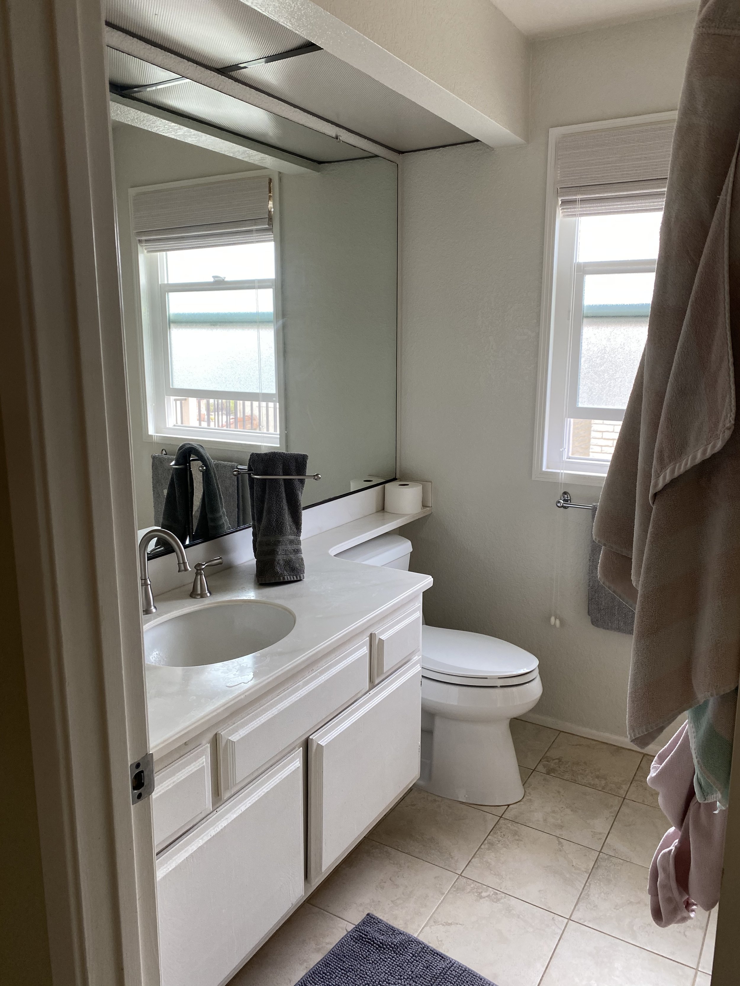
Before the Bathroom Remodel
Before we stepped in, this primary bathroom desperately needed a refresh. A carpet ran along the length of the bathroom floor, and the wall texture was past its prime. Beyond aesthetics, the layout also lacked functionality. There was an awkward bump-out next to the vanity and an elevated shower area that closed off the flow of the space.


Our clients needed a more practical layout, but they didn't want to spend a fortune altering the design, so we knew we'd keep the same general footprint. As for the interior finishes, they wanted the space to feel brighter, more modern, and super luxurious, inspired by Amber Interiors’ California casual vibe with earthy tones and textures.
In addition to the primary bath, our clients also wanted to revamp their kid’s shared bathroom. This space was equally outdated but much smaller, housing only a vanity, toilet, and bathtub. Our clients wanted the new bathroom to have a classic, sophisticated look that complemented the primary bath with a few playful elements the kids wouldn’t outgrow.

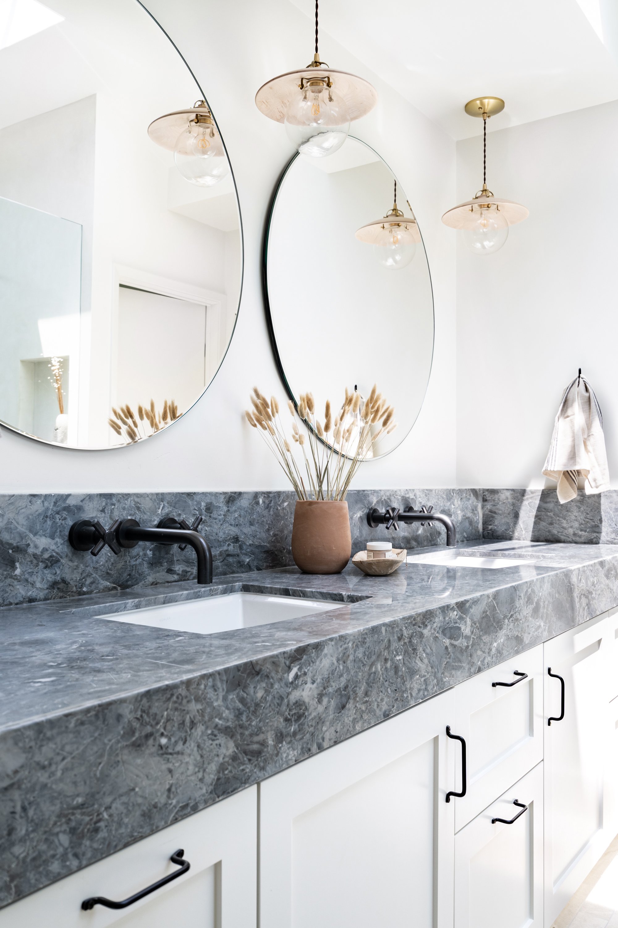
How We Created a Layered, Luxurious Primary Bath
When our clients enter their ensuite bath, they’re now greeted with the bright, modern retreat they dreamed of! One of the most striking details in the new bathroom is the gorgeous countertop slab that contrasts the clean white walls. It’s dark gray with marbled lines and a few minor scratches from when it was blasted from the quarry. Some might have passed on this slab due to those imperfections, but we appreciate how they add a natural, lived-in touch.


Custom cabinets would have added considerable cost to this renovation, so to help our client save a few extra dollars, we installed Ikea kitchen cabinets for their vanity. To give the cabinets a high-end look, we dropped the front of the slab where a drawer would have been on a traditional vanity. This gives the appearance of an extra thick slab that would have cost much more money. Instead of Ikea cabinet fronts, we went with Semihandmade, which allowed us to customize the slightly shorter doors to compensate.
Because our clients loved the Amber Interiors look, we used Shoppe Amber Interiors cabinet hardware for a delicate appearance with a durable feel. If you look closely, you’ll see that we mixed metals on all the fixtures throughout the bathroom: the pendants are wood and brass, the sink faucets are pewter, and the shower system is oil-rubbed bronze.


We knew we wanted to achieve a transitional look by balancing a combination of modern lines and finishes with organic textures. One of the ways we achieved that harmony was by adding movement to the walls with Tadelakt, a Moroccan waterproof plaster. It’s a hand-applied wall surfacing technique that gives an imperfect texture and color for an earthy feel. The wet room walls where we installed the Tadelakt almost look like concrete but creamier and less cold. In the end, the cost of Tadelakt is only slightly greater than purchasing and installing tile, so our clients didn’t need to sacrifice anything to get the look they wanted.
With so much texture on the walls, we wanted to keep the rest of the wet room clean and sleek. We sunk a u-channel into the floor to prevent any hardware from showing on the shower glass so it appears to just float in the space. And to give our clients extra storage, we added a tile ledge behind the bathtub in the Tadelakt surround.
A Sophisticated Kid’s Bath
The kid’s bath needed to feel just as sophisticated and high-end as the primary bath without the hefty price tag of a completely custom remodel. More affordable than custom cabinetry, we bought a gorgeous wood prefab vanity that already came with a countertop and sink. Brushed nickel fixtures and matching hardware helped complete the look.


Our client’s school-aged kids no longer needed a full bath, so they opted for a tiled shower instead. We don’t typically use much color in our projects, but we wanted a little excitement in the kids’ bath, which we achieved with earthy green tile on the shower walls and playful circular tile on the shower floor. Truthfully, there’s nothing overtly kid-like in this room (except for a couple cute photos of the kids sitting on the toilet 😉).
Just like the primary bath, the kids’ bathroom also had an awkward bump out. So to transform this nook into a practical yet stylish space with a purpose, we hollowed the wall and added built-in shelving for storage as well as a rolling laundry basket that tucks neatly into the wall.
We’re absolutely thrilled with the way these bathrooms turned out. If you see something you like from this design, you can shop the look here:

1. leaning ladder 2. round frameless mirror 3. hand towels 4. pendant 5. hand towel hook 6. drawer pull 7. dried grasses 8. towel bar 9. terra cotta vase 10. leaning mirror 11. runner 12. dried daisies 13. copper candle 14. white side table 15. dried lavender
Have you been dreaming of a bathroom renovation in your home? Contact us at design@fleurishinteriors.com to see if we can help!